Discovery – Entry Flow & City Browsing
The first thing a student sees matters.
Chinese international students choosing UK accommodation are making a major decision from thousands of miles away, on a phone, in WeChat. The entry flow had to feel trustworthy and familiar — not like a foreign website they'd close in 3 seconds.
This module got the fundamentals right. But it also got more complicated than it needed to be.
The Problem
Chinese international students don't browse UK accommodation the way UK students do.
They're not familiar with the cities. They don't know which neighborhoods are safe or which are close to their university. They're anxious about making a big decision without being physically there.
What they needed
- Something that felt familiar (WeChat-native, not a foreign app)
- A clear starting point (not 50 properties at once)
- Trust signals (real photos, real pricing, real information in Simplified Chinese)
- A way to narrow down before they get overwhelmed
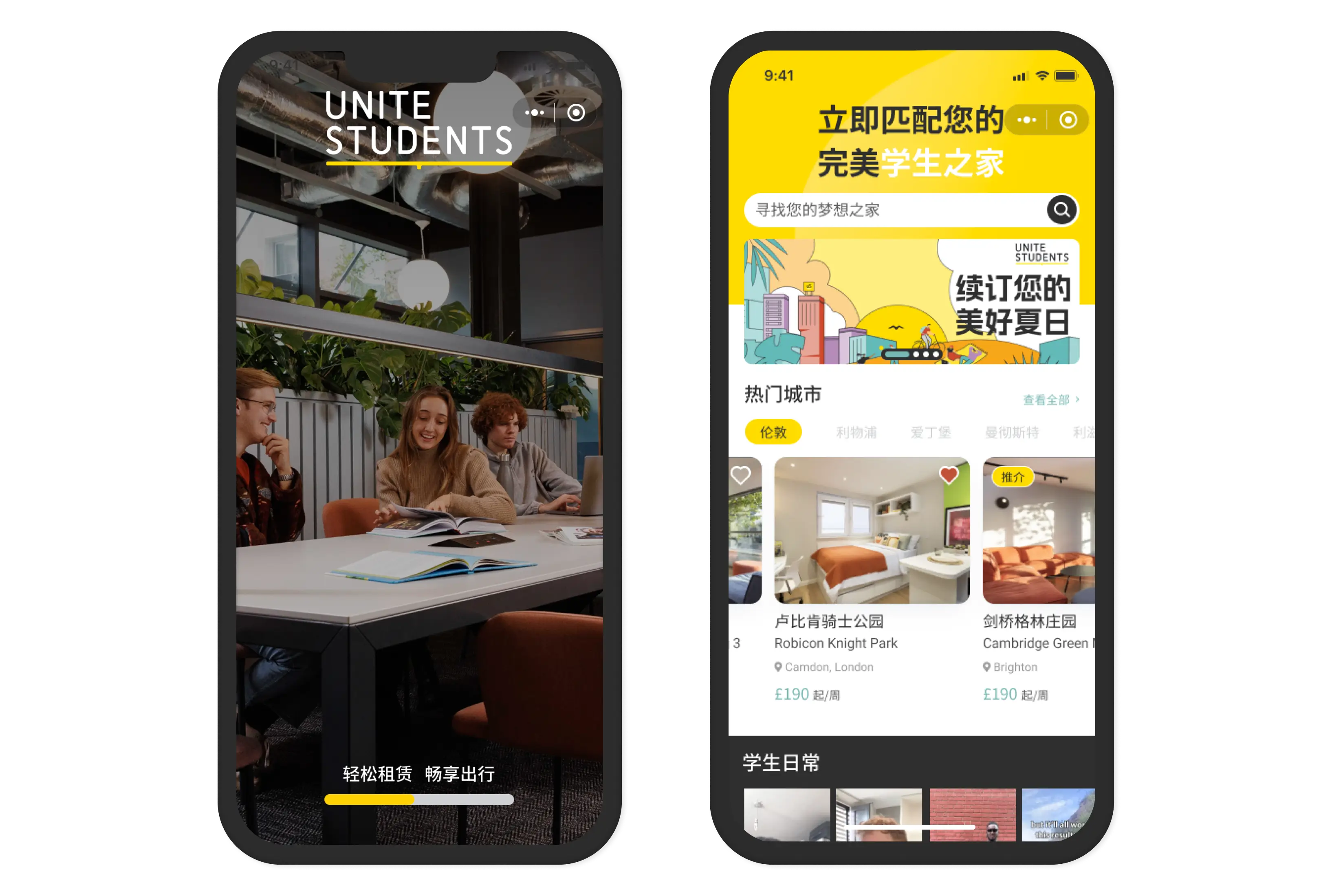
What we designed: A structured entry journey — splash → homepage → city selection → content.
What I Shipped
- Splash screen
- Brand introduction. Simple reassuring message. Sets tone before the student sees anything else.
- Homepage
- The central hub. Hero banner for campaigns, search bar with hot search suggestions, top cities shortcut, featured properties, university-proximity groupings, articles.
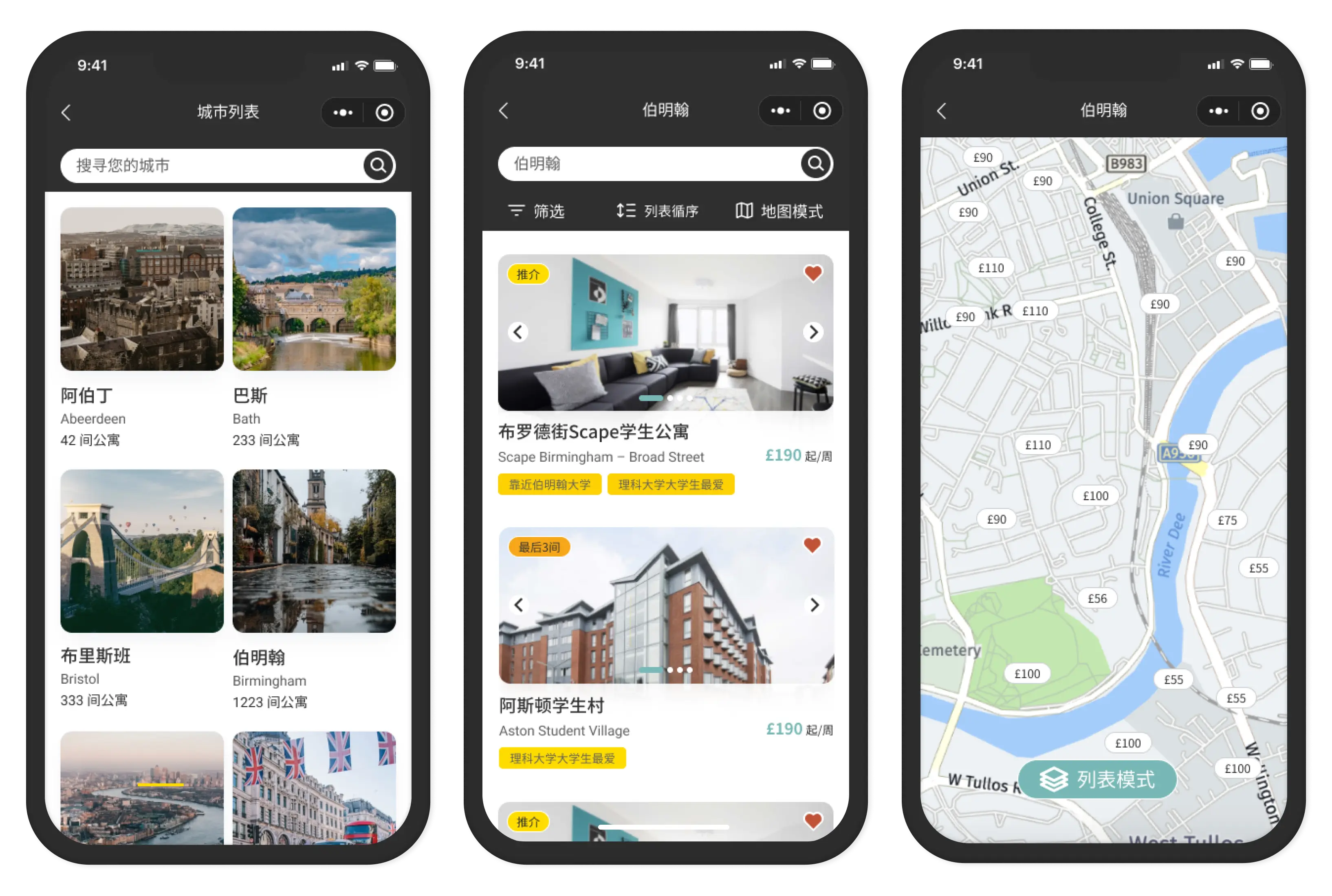
- City Selection
- Grid of all UK cities with property counts. Students pick their city before browsing. City-first, not property-first.
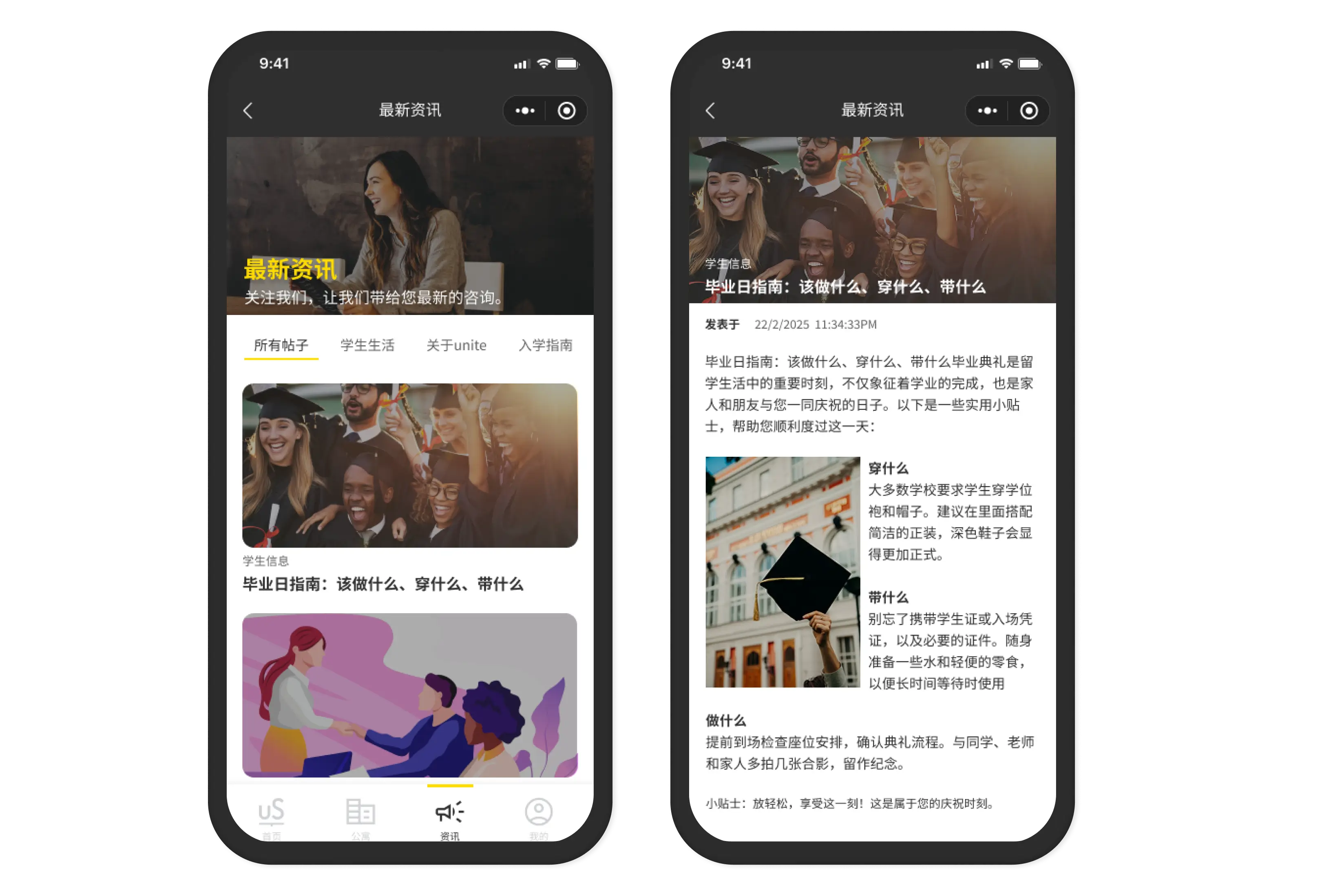
- Latest News
- Articles and guides. Moving tips, UK lifestyle, tenancy advice. Trust-building content for students preparing for life abroad.
The Decision That Actually Mattered
City-first navigation
Most property platforms show you listings immediately. We showed cities first.
The reasoning: 26 cities, hundreds of properties. Without a city anchor, the homepage becomes paralyzing. A student who doesn't know Birmingham from Bristol needs to start with location, not rooms.
This was the right call. But I can't fully prove it — the insight came from a Unite Students stakeholder conversation I didn't document properly. I know it was right because usage showed city selection was the dominant entry point. But I should've captured the evidence when I had it.
The Homepage Problem
The homepage ended up doing too many things.
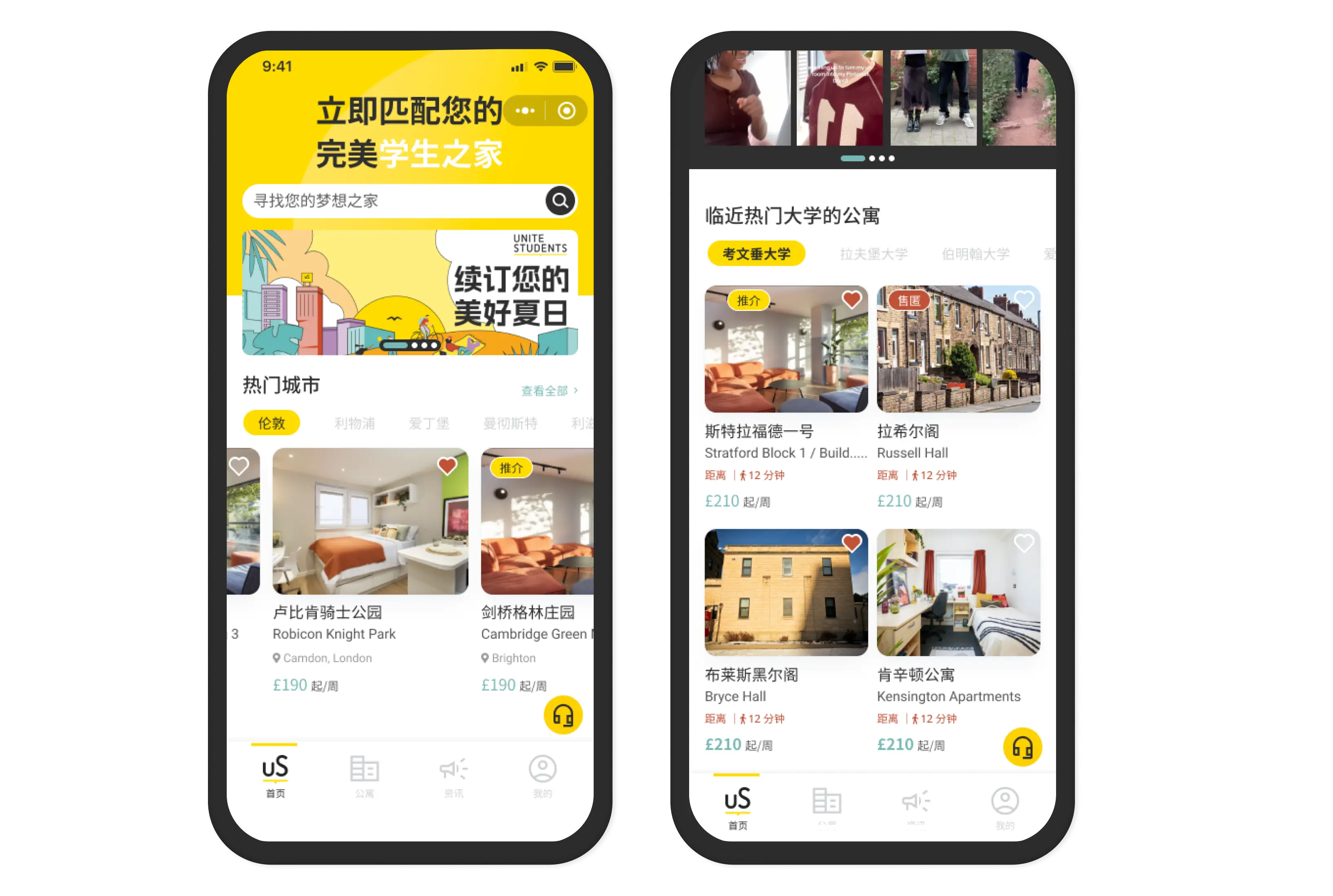
What we put on it
- Hero campaign banner
- Search bar + hot searches
- Top cities shortcut
- Featured property cards
- University-proximity sections
- Latest News articles
That's 6 different sections on one screen.
For a student opening this for the first time, the homepage required a lot of scrolling before they found what they were looking for.
- What I'd do differently
- Test with 3-5 students before finalizing. "Where would you go first?" would've immediately shown whether the homepage helped or overwhelmed.
I designed it based on what stakeholders requested. I didn't validate whether the structure served students.
The Developer Factor
The homepage had scrollable horizontal sections — featured properties, university groupings. These required custom scroll behaviour.
The frontend developer implemented his own version. The scrolling worked, but the visual treatment differed from the Figma design — card sizing, spacing, tap targets were all slightly off.
I caught it during QA. By then it was already in production. We patched what we could, left what was minor.
- What should've happened
- Before I finalized the homepage design, I should've asked the developer: "Can WeChat Mini Program handle horizontal scroll sections natively? Any constraints I should know?"
He would've told me. He just didn't think to volunteer it.
Latest News — What Actually Worked
This section was questioned internally — "do students actually read articles?"
Post-launch: yes. Students engaged with the moving guides and lifestyle content. Not because they wanted to read long articles, but because it made the platform feel like it cared about their whole journey, not just the transaction.
The trust signal worked. A platform that helps you understand UK life feels more trustworthy than one that only sells rooms.
The Honest Take
Discovery worked because the core problem was understood correctly — city-first reduces overwhelm for international students unfamiliar with UK geography.
But the homepage became a collection of stakeholder requests rather than a validated student flow. Six sections. Too much happening. No upfront testing.
The two things I'd change
- Test the homepage before finalizing — 3 students, one question: "Where do you go first?" Would've shown immediately whether the structure helped or confused.
- Ask the developer about WeChat scroll constraints before designing — not after handoff. Before.
Both are the same pattern: I designed first and discovered the problems later. Post-hoc is expensive.